
Showing posts with label columns. Show all posts
Showing posts with label columns. Show all posts
Saturday, October 22, 2011


Sunday, September 25, 2011


Thursday, February 17, 2011
Structure Can Still Be Versatile! Mag Layout 101
 Who Says Structure Can't Be Versatile? I love the layout of this mag. With as much structure as it has, it still is versatille. I love the alignment and the way the repetition presented in this layout. The Images balance well with the typography! Haute!
When Gestalt Shows Up In Mag Layouts!

Tuesday, December 28, 2010
MYFav of 2010: OOOO…WINS- What a Layout!


Terrell Owens pics and the placement of text! This layout is very clean. The use of columns and alignment definitely aid in this layout. The crisp nature of the design assist for making this layout a HEADLINER!
Tuesday, October 26, 2010
FOLD: A Beauty to Behold

I came across this brochure that I thought did a great job at incorporating graphics throughout the design to unite the pieces. The colors pink and brown also unify the elements in the brochure. I also believe the layout gives you detailed information on the services that the spa offers.
Tuesday, October 19, 2010
Grids: Something to Sit On

I found a really good grid layout in a publication design book. The layout is found in a furniture catalog. The grid helps to organize the text and furniture. The grid enables the text to flow freely and the pictures can be replaced easily.
Tuesday, October 12, 2010
Layout Design: Balanced and Still Moving!
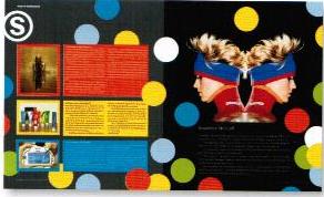 In my recent readings on layout design, the author pointed out that layout design is a balancing act in two senses. According to Graphic Design Basics by Amy Arnston, layout design relates the diverse elements on a printed page in a way that communicates and has aesthetic appeal. Also pointed out is that in all layout design, every element on the page affects how the other elements are perceived. In this layout there is boldness and the circles convey movement. The three colored columns with print on the left page balance the symmetrical image with the black background on the right page.
Tuesday, September 21, 2010
Juggling a Lot? Try Balance!
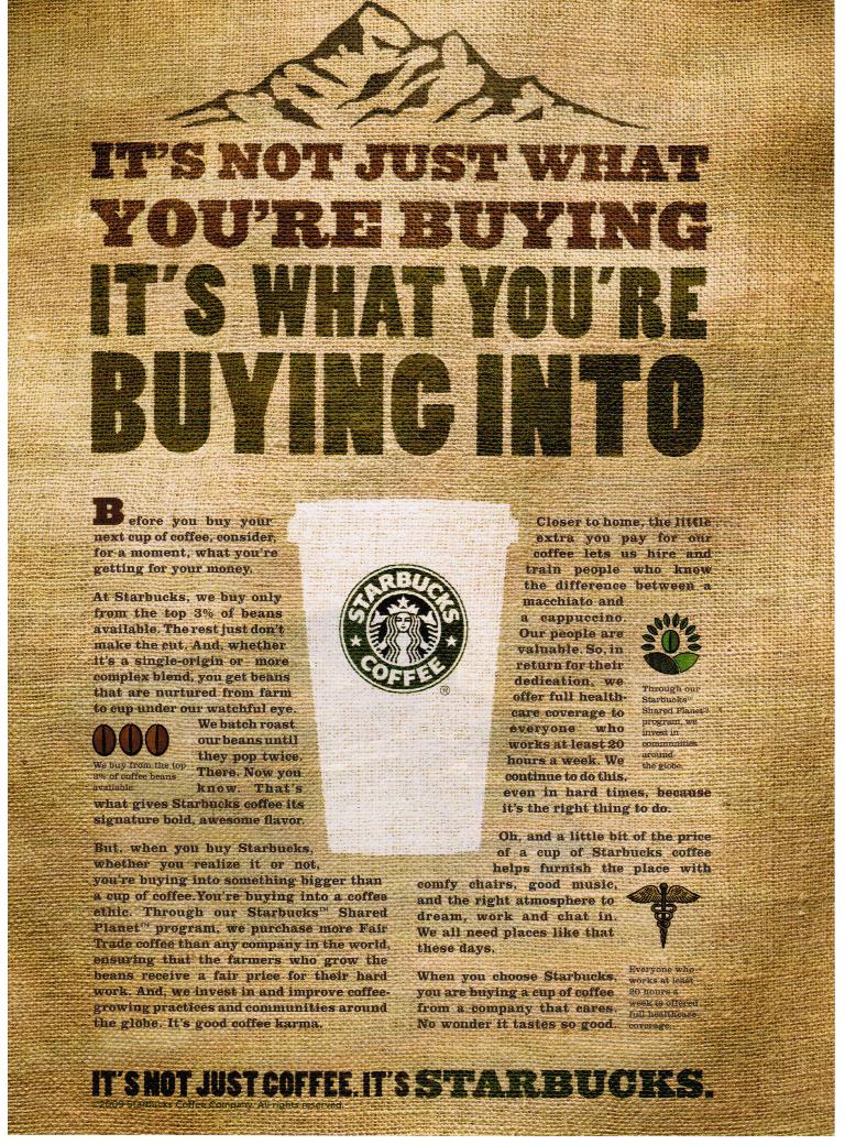
Asymmetrical balance and symmetrical balance are two principles used in design. Sometimes, balancing texts and images can create a problem, however I found two examples of compositions that did a great job at utilizing the principles:
Asymmetrical Balance

Symmetrical Balance
There is a strong emphasis on the Starbucks cup as the center. Surrounding the cup to the left and to the right is the text. Within the text to the left and right of the cup are smaller pictures as well. The larger font at the top of the composition adds to the symmetrical balance. The mountain at the top adds to the symmetrical balance and gives us a dividing point.

Subscribe to:
Posts (Atom)