
Showing posts with label layout. Show all posts
Showing posts with label layout. Show all posts
Sunday, September 25, 2011


Wednesday, May 25, 2011


Friday, May 6, 2011

Thursday, February 17, 2011
When Gestalt Shows Up In Mag Layouts!

Sunday, November 28, 2010
How to Use Adobe CS5 to Create a Newsletter
Newsletters are a great way to reach your targeted demographics. Adobe products such as Indesign, Photoshop and Illustrator can be a help to create the newsletter. Below, the various parts of the newsletter are placed under the best program for the design:
Adobe Indesign
Mailing Panel
Captions
Pull Quotes
End Signs
Headlines
Decorative Text Elements
Table of Contents
Masterhead
(staff names, contributors, subscription information, addresses, logo, etc.)
Headlines
Page Numbers
Bylines
Adobe Photoshop
Photographs
Illustrations
Adobe Illustrator
Logo
Name of newsletter
 |
| Newsletter Designed from ronbutler.com |
Tuesday, October 12, 2010
Layout Design: Balanced and Still Moving!
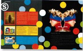 In my recent readings on layout design, the author pointed out that layout design is a balancing act in two senses. According to Graphic Design Basics by Amy Arnston, layout design relates the diverse elements on a printed page in a way that communicates and has aesthetic appeal. Also pointed out is that in all layout design, every element on the page affects how the other elements are perceived. In this layout there is boldness and the circles convey movement. The three colored columns with print on the left page balance the symmetrical image with the black background on the right page.
The Hip in Layout Design

Reading a publication design book, I came accross this layout design. This layout design was located in a hip hop magazine. The layout uses colors, typography, and images to reach the audience. I believe the designer did a great job at balancing the images with the typography and the columns filled with text. While the article offered a lot of information, it did not negate layout design. The article pulls you in for a read.
Subscribe to:
Posts (Atom)