I definitely love this final album cover with NAS and Damian Marley-Distant Relatives! The lyrics are deep as well as the cover. Excellent choice of typography and imagery. I love the way that the image of Africa is placed versus the previous cover! This is a SERIOUS display of design. Great display of balance, color, and contrast.
Tuesday, December 28, 2010
MYFav of 2010: Religion is Dead!
I received this flier in the mail and immediately it caught my eye. I realized it was for a local church’s campaign geared toward awakening the community to the difference between religion and relationship with Christ. The use of the image and text posted on the fence was a great concept for the campaign’s message. In addition the use of the colors and typography was also appropriate.
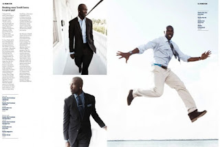
MYFav of 2010: OOOO…WINS- What a Layout!
Terrell Owens pics and the placement of text! This layout is very clean. The use of columns and alignment definitely aid in this layout. The crisp nature of the design assist for making this layout a HEADLINER!
MYFav of 2010: Jot It Down the Right Way
International practice of words and images has always had a lot of flair, especially in India India
Monday, December 20, 2010
PAPER Matters III
When you are choosing paper to design with consider this:
Gloss Finish:
The coating keeps the paper from quickly absorbing ink; glossy papers may dry slower than others. The gloss finish gives a design a photographic look. *Terms such as high gloss, gloss, soft gloss, or semi gloss, are used to indicate the amount of shine. Satin finish is not as shiny.
Matte Finish:
Text and Images printed on matte papers appear soft and not as reflective as gloss finish. Matte finish is not shiny at all. *You can print on both sides of matte finish papers.
PAPER Matters II
When you are choosing paper to design with consider this:
 If a paper is labeled as heavy weight, take caution because that is not always a indication that the paper is heavyweight. Try to get a feel for the paper. Important documents such as resumes, certificates, diplomas, look great with a heavier weight paper.
Weight:
 If a paper is labeled as heavy weight, take caution because that is not always a indication that the paper is heavyweight. Try to get a feel for the paper. Important documents such as resumes, certificates, diplomas, look great with a heavier weight paper.
Caliper:
The thickness of the paper assists with the level of ink coverage on the document. It is the mass of the product per area.
*Be careful because Weight and Caliper differ. For example a pound of feathers and a pound of bricks have the same weight (pound) but their mass differs per unit.
PAPER Matters I
Opacity:
Can you see-through the paper? If the paper has a high opacity, you have a better chance that the printed text and images will not bleed through to the other side. *If you are printing double sided make sure that you have a paper with high opacity.
Brightness:
Is the paper bright? *Because all papers are not numbered, compare paper side by side.
Tuesday, December 7, 2010
Top 10 for Design Inspiration
Time to Design and You Have No Idea What To Do?
10 Ways to Get Great Inspiration for the Design!
- Books. There are thousands and thousands of books on any given topic that you could think of, if not, you may be the very one to write on the topic!
- Websites. Look at what others are doing in Design and Communications.
- Music. Music not only can inspire you but look at the album covers and the inside of the cover.
- Magazines. Look at Magazines (do not limit yourself to magazines specific on design)
- Prior Periods. Artwork and design has evolved throughout the years. Look at the overall history of Artwork.
- Artists and Designers. Consider the artwork of other artists and designers. How do they integrate contrast, repetition, alignment, and proximity?
- Nature. Get outside during the morning, day, or night! Get out and about.
- Buildings. Look at the structure of buildings. Look at the architecture and get inspired.
- Shopping. You can find anything while shopping and design is definitely close by. Look at shopping bags, products, wrappings, advertisements, etc.
- Social Networking. Look what others are doing and saying regarding artwork, communication, and design.
Subscribe to:
Posts (Atom)


