(Refined Edge) located above
Sunday, October 31, 2010
Photoshop Helpful Hint: Refined Edges
A helpful hint that I find in photoshop is the refined button in the toolbar after you make a selection for cutting out a picture.

Tuesday, October 26, 2010
FOLD: A Beauty to Behold

I came across this brochure that I thought did a great job at incorporating graphics throughout the design to unite the pieces. The colors pink and brown also unify the elements in the brochure. I also believe the layout gives you detailed information on the services that the spa offers.
Tuesday, October 19, 2010
Grids: Something to Sit On

I found a really good grid layout in a publication design book. The layout is found in a furniture catalog. The grid helps to organize the text and furniture. The grid enables the text to flow freely and the pictures can be replaced easily.
Tuesday, October 12, 2010
Layout Design: Balanced and Still Moving!
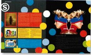 In my recent readings on layout design, the author pointed out that layout design is a balancing act in two senses. According to Graphic Design Basics by Amy Arnston, layout design relates the diverse elements on a printed page in a way that communicates and has aesthetic appeal. Also pointed out is that in all layout design, every element on the page affects how the other elements are perceived. In this layout there is boldness and the circles convey movement. The three colored columns with print on the left page balance the symmetrical image with the black background on the right page.
The Hip in Layout Design

Reading a publication design book, I came accross this layout design. This layout design was located in a hip hop magazine. The layout uses colors, typography, and images to reach the audience. I believe the designer did a great job at balancing the images with the typography and the columns filled with text. While the article offered a lot of information, it did not negate layout design. The article pulls you in for a read.
Wednesday, October 6, 2010
InDesign for the Designer in ME!

InDesign is a really great program to learn. I feel much stronger now that I have a foundation in using it. I especially love working with the many options InDesign offers especially for text and images. Working with rulers, document set up (master page and pages), panels, and much more has been extremely helpful for learning the concepts of graphic design such as contrast, repetition, alignment, and proximity. At first, I was extremely nervous about the speed it would take me to learn the program. I think the foundational principals of using InDesign are not too difficult to understand. I am looking forward to utilizing all of the Adobe products together in the near future and for other classes and projects. I am definitely a new Adobe convert!
Tuesday, October 5, 2010
Typography: Roll with IT!

I love this album cover for the Rolling Stones! The title “Rolled Gold” says it all! The title is very decorative with the rich gold color on the black ground background. The glyph adds to the title without taking away that the designer wants to present the history of songs by the Rolling Stones. The feeling that I get from the cover is simple, fancy, but rich. The typography conveys a rich history without the songs having to be sung by the Rolling Stones! I can definitely roll with it!
My TYPE of Book
Typography must have readability and convey a feeling! I was ordering a book on Amazon.com and Get a Life, Not a Job by Paula Caligiuri, Ph.D, caught my attention. Considering what I recently learned in class regarding typography, I felt like this book did a great job in this specific area of design. The color and the typestyle for the word life automatically connects us to the game of Life. The type and glyph in the word job automatically conveys “no job” before we have enough time to read the entire title of the book cover. The font for the words “life” and “job” immediately draw your attention to those words, being the most important. The use of typography for this book cover assisted the reader (myself) to know what the book was about without even reading the summary! Great Cover!

Subscribe to:
Posts (Atom)