Tuesday, December 28, 2010

MYFav of 2010: A Cover is Worth A Thousand Lyrics!

I definitely love this final album cover with NAS and Damian Marley-Distant Relatives!  The lyrics are deep as well as the cover.  Excellent choice of typography and imagery.  I love the way that the image of Africa is placed versus the previous cover! This is a SERIOUS display of design. Great display of balance, color, and contrast. 

MYFav of 2010: Religion is Dead!

I received this flier in the mail and immediately it caught my eye.  I realized it was for a local church’s campaign geared toward awakening the community to the difference between religion and relationship with Christ.  The use of the image and text posted on the fence was a great concept for the campaign’s message.  In addition the use of the colors and typography was also appropriate.

MYFav of 2010: OOOO…WINS- What a Layout!


Terrell Owens pics and the placement of text!  This layout is very clean.  The use of columns and alignment definitely aid in this layout.  The crisp nature of the design assist for making this layout a HEADLINER!

MYFav of 2010: Jot It Down the Right Way

International practice of words and images has always had a lot of flair, especially in India!  I love this planner’s cover.  While the front cover is busy, Grandmother India did at great job at utilizing custom made type, illustration, and digital imagery for a product that will be apart of a person’s daily routine! The cover reminds us of the importance of recycling and the color choice for the green is vibrant.  Makes you feel great for being a tree hugger! Save the Earth!

Monday, December 20, 2010

PAPER Matters III

When you are choosing paper to design with consider this:

Gloss Finish:
The coating keeps the paper from quickly absorbing ink; glossy papers may dry slower than others.   The gloss finish gives a design a photographic look. *Terms such as high gloss, gloss, soft gloss, or semi gloss, are used to indicate the amount of shine.  Satin finish is not as shiny.

Matte Finish:
Text and Images printed on matte papers appear soft and not as reflective as gloss finish.  Matte finish is not shiny at all. *You can print on both sides of matte finish papers.

PAPER Matters II

When you are choosing paper to design with consider this:

Weight:
If a paper is labeled as heavy weight, take caution because that is not always a indication that the paper is heavyweight.  Try to get a feel for the paper. Important documents such as resumes, certificates, diplomas, look great with a heavier weight paper.

Caliper:
The thickness of the paper assists with the level of ink coverage on the document. It is the mass of the product per area.

*Be careful because Weight and Caliper differ. For example a pound of feathers and a pound of bricks have the same weight (pound) but their mass differs per unit.

PAPER Matters I

When you are choosing paper to design with consider this:

Opacity:
Can you see-through the paper? If the paper has a high opacity, you have a better chance that the printed text and images will not bleed through to the other side.  *If you are printing double sided make sure that you have a paper with high opacity.


Brightness:
Is the paper bright? *Because all papers are not numbered, compare paper side by side.

Tuesday, December 7, 2010

Top 10 for Design Inspiration


Tired of the Same Ole Thing? Not Feeling Inspired?
Time to Design and You Have No Idea What To Do? 
10 Ways to Get Great Inspiration for the Design!

  1. Books. There are thousands and thousands of books on any given topic that you could think of, if not, you may be the very one to write on the topic!
  2. Websites.  Look at what others are doing in Design and Communications.
  3. Music.  Music not only can inspire you but look at the album covers and the inside of the cover.
  4. Magazines.  Look at Magazines (do not limit yourself to magazines specific on design)
  5. Prior Periods.  Artwork and design has evolved throughout the years.  Look at the overall history of Artwork.
  6. Artists and Designers. Consider the artwork of other artists and designers. How do they integrate contrast, repetition, alignment, and proximity?
  7. Nature.  Get outside during the morning, day, or night!  Get out and about. 
  8. Buildings.  Look at the structure of buildings.  Look at the architecture and get inspired.
  9. Shopping.   You can find anything while shopping and design is definitely close by.  Look at shopping bags, products, wrappings, advertisements, etc.
  10. Social Networking. Look what others are doing and saying regarding artwork, communication, and design.

Sunday, November 28, 2010

How to Use Adobe CS5 to Create a Newsletter

Newsletters are a great way to reach your targeted demographics. Adobe products such as Indesign, Photoshop and Illustrator can be a help to create the newsletter.  Below, the various parts of the newsletter are placed under the best program for the design:
Adobe Indesign
Mailing Panel
Captions
Pull Quotes
End Signs
Headlines
Decorative Text Elements
Table of Contents
Masterhead
(staff names, contributors, subscription information, addresses, logo, etc.)
Headlines
Page Numbers
Bylines

Adobe Photoshop
Photographs
Illustrations

Adobe Illustrator
Logo
Name of newsletter


Newsletter Designed from ronbutler.com


Tuesday, November 16, 2010

Bad to the Bone Branding

The House of Dereon branding is a reflection of daring approach and bold ideas. This Spring 2010 advertisement selection is fierce, stylish, edgy, and sexy.   The fashions are playful as evident in this advertisement as well.

Tuesday, November 9, 2010

31 Flavors and Design is ONE!

Now I love Baskin Robbins logo!  The logo incorporates playful use of colors in addition to the 31 highlighted in pink. This design appeals to you people as well as older ones! Great use of Gestalt! 

A Lesson In History for LOGOS

I love the Reginald F. Lewis Museum of Maryland African American History and Culture's logo design.  The design cptured the essence of Maryland as well as African American History by using colors and images! I love it!

For the RECORD Logos Matter!

The logo design for Epic Records could have done a better job at using image to convey that it is a Records company. The design does not say "Records".  I think by adding an image would have better impact the design.

What Does Beauty have to do with Logo Design? EVERYTHING!

As I browse through one of my favorite fashion magazines, I stumble upon this logo for Ultra Beauty.  While there products are worthwhile this design is lacking in the area of  beauty! There is nothing that stands out to me that says, "Beauty".  Not a Good Logo Design!

Tuesday, November 2, 2010

There's Hope for Correct Color Use!

Browsing http://hyperakt.com/ I came accross this poster.  I believe that the use of the colors help to distinguish Obama's facial characteristics. This is a great use of color.

Color: Is There Room On The Court?

Considering that color has been described as the way an object absorbs or reflects light, I don't feel that the advertisement does a good job at making the yellow M&M stand out.  The yellow M&M blends in with the surroundings.  There is not enough contrast for the yellow M&M.  The green M&M stands out more.  Maybe a red M&M, could have been used to bring more attention to the two M&M's. 

Sunday, October 31, 2010

Photoshop Helpful Hint: Refined Edges

A helpful hint that I find in photoshop is the refined button in the toolbar after you make a selection for cutting out a picture. 

                                                                                          (Refined Edge) located above

Tuesday, October 26, 2010

FOLD: A Beauty to Behold

I came across this brochure that I thought did a great job at incorporating graphics throughout the design to unite the pieces.  The colors pink and brown also unify the elements in the brochure.  I also believe the layout gives you detailed information on the services that the spa offers.

Tuesday, October 19, 2010

Grids: Something to Sit On

I found a really good grid layout in a publication design book.  The layout is found in a furniture catalog.  The grid helps to organize the text and furniture.  The grid enables the text to flow freely and the pictures can be replaced easily. 

Tuesday, October 12, 2010

Layout Design: Balanced and Still Moving!

In my recent readings on layout design, the author pointed out that layout design is a balancing act in two senses.  According to Graphic Design Basics by Amy Arnston, layout design relates the diverse elements on a printed page in a way that communicates and has aesthetic appeal.  Also pointed out is that in all layout design, every element on the page affects how the other elements are perceived.  In this layout there is boldness and the circles convey movement.  The three colored columns with print on the left page balance the symmetrical image with the black background on the right page.

The Hip in Layout Design


Reading a publication design book, I came accross this layout design.  This layout design was located in a hip hop magazine.  The layout uses colors, typography, and images to reach the audience.  I believe the designer did a great job at balancing the images with the typography and the columns filled with text.  While the article offered a lot of information, it did not negate layout design.  The article pulls you in for a read.

Wednesday, October 6, 2010

InDesign for the Designer in ME!


InDesign is a really great program to learn. I feel much stronger now that I have a foundation in using it. I especially love working with the many options InDesign offers especially for text and images.  Working with rulers, document set up (master page and pages), panels, and much more has been extremely helpful for learning the concepts of graphic design such as contrast, repetition, alignment, and proximity.  At first, I was extremely nervous about the speed it would take me to learn the program. I think the foundational principals of using InDesign are not too difficult to understand.  I am looking forward to utilizing all of the Adobe products together in the near future and for other classes and projects.  I am definitely a new Adobe convert! 

Tuesday, October 5, 2010

Typography: Roll with IT!


I love this album cover for the Rolling Stones!  The title “Rolled Gold” says it all! The title is very decorative with the rich gold color on the black ground background. The glyph adds to the title without taking away that the designer wants to present the history of songs by the Rolling Stones.  The feeling that I get from the cover is simple, fancy, but rich.  The typography conveys a rich history without the songs having to be sung by the Rolling Stones! I can definitely roll with it!

My TYPE of Book

Typography must have readability and convey a feeling!  I was ordering a book on Amazon.com and Get a Life, Not a Job by Paula Caligiuri, Ph.D, caught my attention.  Considering what I recently learned in class regarding typography, I felt like this book did a great job in this specific area of design.  The color and the typestyle for the word life automatically connects us to the game of Life.  The type and glyph in the word job automatically conveys “no job” before we have enough time to read the entire title of the book cover.  The font for the words “life” and “job” immediately draw your attention to those words, being the most important.  The use of typography for this book cover assisted the reader (myself) to know what the book was about without even reading the summary!  Great Cover!

Monday, September 27, 2010

Raining with Creativity


Browsing through Essence magazine, I came across this advertisement.  At the bottom of the ad it reads: The simplest moments are the most refreshing. I believe that this composition’s use of creative concepts contributes to the advertisement’s statement at the bottom. Chili, a singer, and her son in the background appeal to the demographics for Essence Magazine.  From the water falling in the background we get the notion of “dancing and singing in the rain”; that is, enjoying what life brings. We also see the oversized Dasani water bottle serving as figure.  The bottle’s placement makes it appear 3D and it made me want to just reach out and grab it.   The ad delivered the message before I read the bottom lines. 

The Nature of Creativity


Browsing through Money Magazine, I came across this ad for Kia. Kia did a great job at using nature vs. technology to make a statement about the Kia Forte.  The black background makes it easy to see the camel with spots.  We know that camels are animals that can go a long distant without having to stop; however, we have never seen a camel with spots!  This is like a cross between a leopard and a camel!  In between the camel and the vehicle are the words: Fast and Fuel efficient!  Also the bottom of the ad begins, “The world has never seen anything like this…”   The ad did a great job at delivering the message using creativity. 

Tuesday, September 21, 2010

Juggling a Lot? Try Balance!

Asymmetrical balance and symmetrical balance are two principles used in design. Sometimes, balancing texts and images can create a problem, however I found two examples of compositions that did a great job at utilizing the principles: 

Asymmetrical Balance
This page layout uses 3 columns.  In the far left two columns are the texts and in the far right column are the pictures. The two columns of text are balanced by the photos in the left column and the photo at the top of the page helps to balance the text at the bottom of the page.  
  

Symmetrical Balance
There is a strong emphasis on the Starbucks cup as the center. Surrounding the cup to the left and to the right is the text. Within the text to the left and right of the cup are smaller pictures as well.  The larger font at the top of the composition adds to the symmetrical balance.  The mountain at the top adds to the symmetrical balance and gives us a dividing point.


Tuesday, September 14, 2010

Beauty is Skin Deep BUT DESIGN is to the BONE!

Adobe InDesign CS5! I can’t live without it!  What have I been doing all of these years with Microsoft Publisher!  I am not knocking Microsoft by the long shot, but for my publishing needs…it must be Adobe!!! InDesign provides me more options for images, letters, and text!  I learned how to create a new document, use color, work with the panels, create master pages, and even how to import graphics. I felt as if I was putting on my wings.  Can’t wait to fly! There is so much to learn and I am looking forward to learning more!

http://www.adobe.com/products/indesign/

Monday, September 13, 2010

Figuring It OUT!

How many times have you tried to come up with a creative way to approach a new design? When it comes to designing, a great way to think “out of the box” is to use Gestalt’s Theory on figure and ground. Often times we can view Gestalt’s theory of figure and ground in logos. I especially enjoy LG products and I think their logo is a great approach to using figure and ground. As ground you are able to see the smiling face and as figure you are able to see the L and G. Great Logo!
http://www.lg.com/

From CRAP to Masterpiece


This is definitely one arena where CRAP can turn out to be a masterpiece. As a designer, working with contrast, repetition, alignment, and proximity (CRAP) can be prove to be beneficial. As I happened to be traveling in the local subway, I came across this poster for McDonalds. In the center of the poster is a glass containing the strawberry and banana milkshake? Surrounding the glass are the banana and strawberries. Not to mention that the text is placed directly above the glass. This is a great design containing alignment.

Software Matters: The Reality

Whether or not I want to face it, I have to! Software capabilities have a lot to do with the completion of a project! Boy, oh boy did I learn. In the first homework assignment, I gained a wealth of knowledge regarding to the use of figure and ground. I decided to use figure and ground with the letter h, a face of an owl and a bird flying, and a design using arrows! I found out that I had a better chance at developing my finished product with Adobe! The reality is Adobe products are a must! Whatever you do, please do not try this at home without the proper software because it matters!


Sunday, September 5, 2010

HAUTE or NOT? In the World of Design

“My argument is that all graphic designers hold high levels of responsibility in society. We take invisible ideas and make them tangible. That’s our job,’’stated Neville Brody, graphic desiger, typographer, and art director. As I begin to learn the steps in the process of design, I ponder the how, what, when, where, and why of  taking invisible ideas and making them tangible.  To assist me in this task, I decided to consider some designs.  A couple of the designs I liked and a couple of designs I disliked. The following are the designs:

Toyota’s Homepage

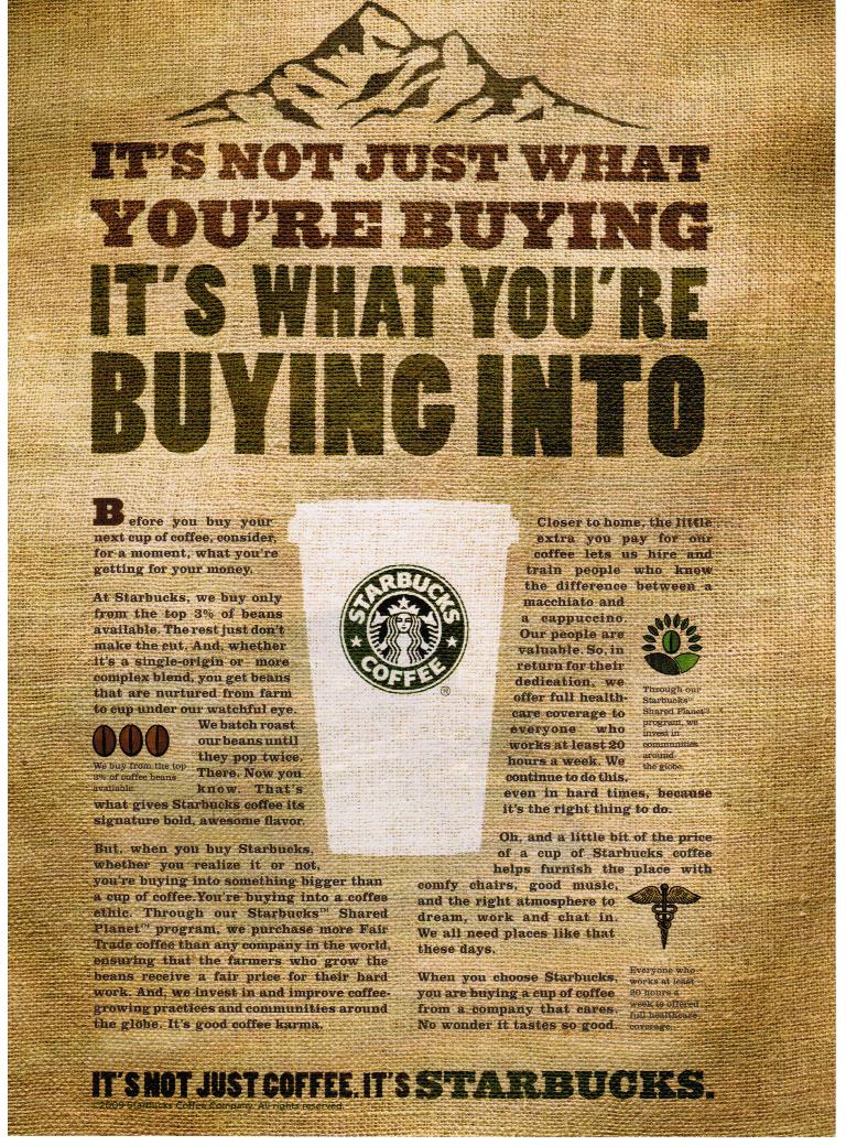
Graphic design is about problem solving. Toyota Motor Sales has done a great job at designing a webpage that addresses the recall situation that occurred earlier this year. Toyota recalled vehicles that had a defect in the braking system and as a result the vehicles were unable to stop. Toyota's homepage shows the Corrolla stopped at the edge of a diving board and surrounded by water. This is a great concept. At the same time the webpage also captures the slogan, “Moving Forward, With Toyota” because directly in front of the Corrolla is the scene of a celebration. I like the design for these reasons. Definitely Haute!

Advertisement for Stride Chewing Gum

Taking it all in Stride! As I opened to the back of the cover page of a local magazine designed for students, I was immediately captured by the full page advertisement for Stride chewing gum! The advertisement gave me a sense of refreshing.  What a great way to start out the school year!  The open space in the advertisement and the chosen font styles gave me a sense of opening up to take leaps, not just strides. I was so impressed by the final product of this design that I purchased the chewing gum! I love Stride chewing gum! I like the design for these reasons. Definitely Haute!

Sign for BGC Contracting Inc.
I believe that designs are of importance in all industries, including construction. Short cutting any step in the design process should never be an option. As I went for a walk at the local harbor, I came across a sign that could have been further developed. At the appearance of the sign I would not have known that it was an advertisement for a construction company. Although, the company may be great at what it does, the sign does not dipict the company's capabilities.  I am not  interested in knowing more about the company, by just looking at the sign. The colors, the use of the oval shape, and the acronym could have complimented each other better. I did not like the design. Not Haute!

Book Cover for Book on Prayers
Never judge a book by its cover.  I learned in class that the lack of proper funding can be a challenge to any designer. Funding allows a designer to know what he or she can or can not use to produce the end product. In the picture above, the designer use the colors red and white and the word prayers.  The cover of the book could have been better designed, even after considering that the book may have been published with low funds. The font style for the word prayer on the cover could have been changed to give the book more of an appeal.  If I did not receive this as a gift, I would not have ever picked it up to read. There are so many books on prayer and this book would not have stood out to me.  I would have never known how helpful the book was by just looking at the cover. I did not like the design. Not Haute!