 In my recent readings on layout design, the author pointed out that layout design is a balancing act in two senses. According to Graphic Design Basics by Amy Arnston, layout design relates the diverse elements on a printed page in a way that communicates and has aesthetic appeal. Also pointed out is that in all layout design, every element on the page affects how the other elements are perceived. In this layout there is boldness and the circles convey movement. The three colored columns with print on the left page balance the symmetrical image with the black background on the right page.
Tuesday, October 12, 2010
Layout Design: Balanced and Still Moving!
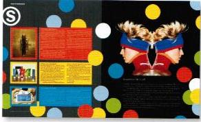
 In my recent readings on layout design, the author pointed out that layout design is a balancing act in two senses. According to Graphic Design Basics by Amy Arnston, layout design relates the diverse elements on a printed page in a way that communicates and has aesthetic appeal. Also pointed out is that in all layout design, every element on the page affects how the other elements are perceived. In this layout there is boldness and the circles convey movement. The three colored columns with print on the left page balance the symmetrical image with the black background on the right page.
Subscribe to:
Post Comments (Atom)
No comments:
Post a Comment