Browsing through Essence magazine, I came across this advertisement. At the bottom of the ad it reads: The simplest moments are the most refreshing. I believe that this composition’s use of creative concepts contributes to the advertisement’s statement at the bottom. Chili, a singer, and her son in the background appeal to the demographics for Essence Magazine. From the water falling in the background we get the notion of “dancing and singing in the rain”; that is, enjoying what life brings. We also see the oversized Dasani water bottle serving as figure. The bottle’s placement makes it appear 3D and it made me want to just reach out and grab it. The ad delivered the message before I read the bottom lines.
Monday, September 27, 2010
The Nature of Creativity
Browsing through Money Magazine, I came across this ad for Kia. Kia did a great job at using nature vs. technology to make a statement about the Kia Forte. The black background makes it easy to see the camel with spots. We know that camels are animals that can go a long distant without having to stop; however, we have never seen a camel with spots! This is like a cross between a leopard and a camel! In between the camel and the vehicle are the words: Fast and Fuel efficient! Also the bottom of the ad begins, “The world has never seen anything like this…” The ad did a great job at delivering the message using creativity.
Tuesday, September 21, 2010
Juggling a Lot? Try Balance!
Asymmetrical balance and symmetrical balance are two principles used in design. Sometimes, balancing texts and images can create a problem, however I found two examples of compositions that did a great job at utilizing the principles:
Asymmetrical Balance
Symmetrical Balance
There is a strong emphasis on the Starbucks cup as the center. Surrounding the cup to the left and to the right is the text. Within the text to the left and right of the cup are smaller pictures as well. The larger font at the top of the composition adds to the symmetrical balance. The mountain at the top adds to the symmetrical balance and gives us a dividing point.
Tuesday, September 14, 2010
Beauty is Skin Deep BUT DESIGN is to the BONE!
 |
| http://www.adobe.com/products/indesign/ |
Monday, September 13, 2010
Figuring It OUT!
How many times have you tried to come up with a creative way to approach a new design? When it comes to designing, a great way to think “out of the box” is to use Gestalt’s Theory on figure and ground. Often times we can view Gestalt’s theory of figure and ground in logos. I especially enjoy LG products and I think their logo is a great approach to using figure and ground. As ground you are able to see the smiling face and as figure you are able to see the L and G. Great Logo!
 |
| http://www.lg.com/ |
From CRAP to Masterpiece
This is definitely one arena where CRAP can turn out to be a masterpiece. As a designer, working with contrast, repetition, alignment, and proximity (CRAP) can be prove to be beneficial. As I happened to be traveling in the local subway, I came across this poster for McDonalds. In the center of the poster is a glass containing the strawberry and banana milkshake? Surrounding the glass are the banana and strawberries. Not to mention that the text is placed directly above the glass. This is a great design containing alignment.
Software Matters: The Reality
Whether or not I want to face it, I have to! Software capabilities have a lot to do with the completion of a project! Boy, oh boy did I learn. In the first homework assignment, I gained a wealth of knowledge regarding to the use of figure and ground. I decided to use figure and ground with the letter h, a face of an owl and a bird flying, and a design using arrows! I found out that I had a better chance at developing my finished product with Adobe! The reality is Adobe products are a must! Whatever you do, please do not try this at home without the proper software because it matters!


Sunday, September 5, 2010
HAUTE or NOT? In the World of Design
“My argument is that all graphic designers hold high levels of responsibility in society. We take invisible ideas and make them tangible. That’s our job,’’stated Neville Brody, graphic desiger, typographer, and art director. As I begin to learn the steps in the process of design, I ponder the how, what, when, where, and why of taking invisible ideas and making them tangible. To assist me in this task, I decided to consider some designs. A couple of the designs I liked and a couple of designs I disliked. The following are the designs:
Toyota’s Homepage

Toyota’s Homepage

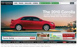
Graphic design is about problem solving. Toyota Motor Sales has done a great job at designing a webpage that addresses the recall situation that occurred earlier this year. Toyota recalled vehicles that had a defect in the braking system and as a result the vehicles were unable to stop. Toyota's homepage shows the Corrolla stopped at the edge of a diving board and surrounded by water. This is a great concept. At the same time the webpage also captures the slogan, “Moving Forward, With Toyota” because directly in front of the Corrolla is the scene of a celebration. I like the design for these reasons. Definitely Haute!
Advertisement for Stride Chewing Gum
Taking it all in Stride! As I opened to the back of the cover page of a local magazine designed for students, I was immediately captured by the full page advertisement for Stride chewing gum! The advertisement gave me a sense of refreshing. What a great way to start out the school year! The open space in the advertisement and the chosen font styles gave me a sense of opening up to take leaps, not just strides. I was so impressed by the final product of this design that I purchased the chewing gum! I love Stride chewing gum! I like the design for these reasons. Definitely Haute!
Sign for BGC Contracting Inc.
I believe that designs are of importance in all industries, including construction. Short cutting any step in the design process should never be an option. As I went for a walk at the local harbor, I came across a sign that could have been further developed. At the appearance of the sign I would not have known that it was an advertisement for a construction company. Although, the company may be great at what it does, the sign does not dipict the company's capabilities. I am not interested in knowing more about the company, by just looking at the sign. The colors, the use of the oval shape, and the acronym could have complimented each other better. I did not like the design. Not Haute!
Book Cover for Book on Prayers
Never judge a book by its cover. I learned in class that the lack of proper funding can be a challenge to any designer. Funding allows a designer to know what he or she can or can not use to produce the end product. In the picture above, the designer use the colors red and white and the word prayers. The cover of the book could have been better designed, even after considering that the book may have been published with low funds. The font style for the word prayer on the cover could have been changed to give the book more of an appeal. If I did not receive this as a gift, I would not have ever picked it up to read. There are so many books on prayer and this book would not have stood out to me. I would have never known how helpful the book was by just looking at the cover. I did not like the design. Not Haute!
Subscribe to:
Comments (Atom)


