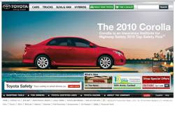
Toyota’s Homepage

Graphic design is about problem solving. Toyota Motor Sales has done a great job at designing a webpage that addresses the recall situation that occurred earlier this year. Toyota recalled vehicles that had a defect in the braking system and as a result the vehicles were unable to stop. Toyota's homepage shows the Corrolla stopped at the edge of a diving board and surrounded by water. This is a great concept. At the same time the webpage also captures the slogan, “Moving Forward, With Toyota” because directly in front of the Corrolla is the scene of a celebration. I like the design for these reasons. Definitely Haute!
Advertisement for Stride Chewing Gum
Taking it all in Stride! As I opened to the back of the cover page of a local magazine designed for students, I was immediately captured by the full page advertisement for Stride chewing gum! The advertisement gave me a sense of refreshing. What a great way to start out the school year! The open space in the advertisement and the chosen font styles gave me a sense of opening up to take leaps, not just strides. I was so impressed by the final product of this design that I purchased the chewing gum! I love Stride chewing gum! I like the design for these reasons. Definitely Haute!
Sign for BGC Contracting Inc.
I believe that designs are of importance in all industries, including construction. Short cutting any step in the design process should never be an option. As I went for a walk at the local harbor, I came across a sign that could have been further developed. At the appearance of the sign I would not have known that it was an advertisement for a construction company. Although, the company may be great at what it does, the sign does not dipict the company's capabilities. I am not interested in knowing more about the company, by just looking at the sign. The colors, the use of the oval shape, and the acronym could have complimented each other better. I did not like the design. Not Haute!
Book Cover for Book on Prayers
Never judge a book by its cover. I learned in class that the lack of proper funding can be a challenge to any designer. Funding allows a designer to know what he or she can or can not use to produce the end product. In the picture above, the designer use the colors red and white and the word prayers. The cover of the book could have been better designed, even after considering that the book may have been published with low funds. The font style for the word prayer on the cover could have been changed to give the book more of an appeal. If I did not receive this as a gift, I would not have ever picked it up to read. There are so many books on prayer and this book would not have stood out to me. I would have never known how helpful the book was by just looking at the cover. I did not like the design. Not Haute!


I agree with your take on the construction ad. Although, I did automatically connect the orange color with construction hats, but only after the word "construction" was read in your post.
ReplyDeleteThe ad actually only uses the words: builder, guru, and contractor. Maybe they could have used the orange as a background color in the shape of a construction hat to create a symbol to reflect the meaning of their ad.
Are construction hats orange? Or perhaps my eyes have been trained to connect the color of orange to constuction from the numerous orange cones I see while driving on the highway. ;-)