Asymmetrical balance and symmetrical balance are two principles used in design. Sometimes, balancing texts and images can create a problem, however I found two examples of compositions that did a great job at utilizing the principles:
Asymmetrical Balance

Symmetrical Balance
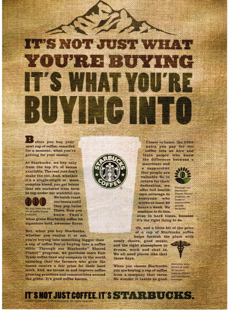
There is a strong emphasis on the Starbucks cup as the center. Surrounding the cup to the left and to the right is the text. Within the text to the left and right of the cup are smaller pictures as well. The larger font at the top of the composition adds to the symmetrical balance. The mountain at the top adds to the symmetrical balance and gives us a dividing point.

No comments:
Post a Comment